
Elevating Spoonflower // Rebranding After Fifteen Years

Spoonflower debuts their rebrand at Apartment Therapy's annual SmallCool event in NYC. Photo credit: Alex Craig
The Power of a Brand
We were thrilled to be trusted with Spoonflower’s recent logo refresh, a meaningful project for the brand after fifteen years in business. As the Cowboys began the work, it became clear that we needed to think bigger than a new logo to elevate the brand. As the scope grew to a more comprehensive brand identity refresh, our Cowboys’ experience and expertise with brand work took center stage. Through hours of brainstorming and frequent meetings with the client’s brand team, we came up with more than a logo mark. We’re proud to have created a new look and feel that showcases the company’s evolution from a household name among craft aficionados to an influential design and decor company.
“This was really a moment for us to make an evolutionary shift, both to represent the growth and sophistication of our amazing customers and to move Spoonflower into the future. We wanted to respect where we are as a company, but also use the brand identity project as a stake in the ground to say–yes we are a creative company in our bones, but more importantly, we represent an amazing community of creators and artists and we want them to shine above all.”
The challenge was to ensure the new brand represented Spoonflower as well as the community of designers and artists they represent. The word mark conveys the marked shift to a more elevated style while the flower logo aims to more accurately represent the history of the company. Spoonflower teal in the color story remained from the original, a nod to its long history.

We are immensely proud to have worked on this project. As a stable of freelancers, brand identity work is one of our favorite services because it allows us to step behind the curtain of our clients’ motivations, dreams and business objectives for a 360 degree approach to brand storytelling. This is where Cowboy Collective’s creativity thrives and our internal sense of collaboration kicks into high gear.
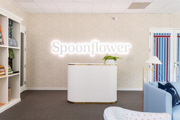
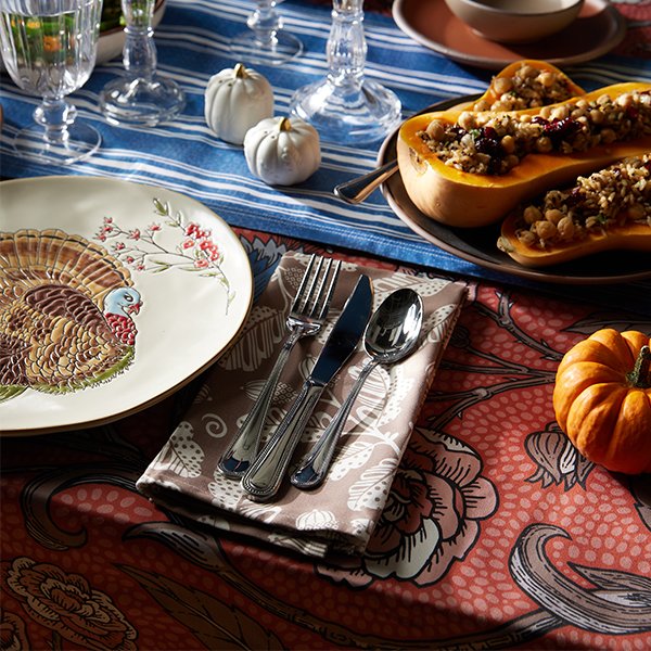
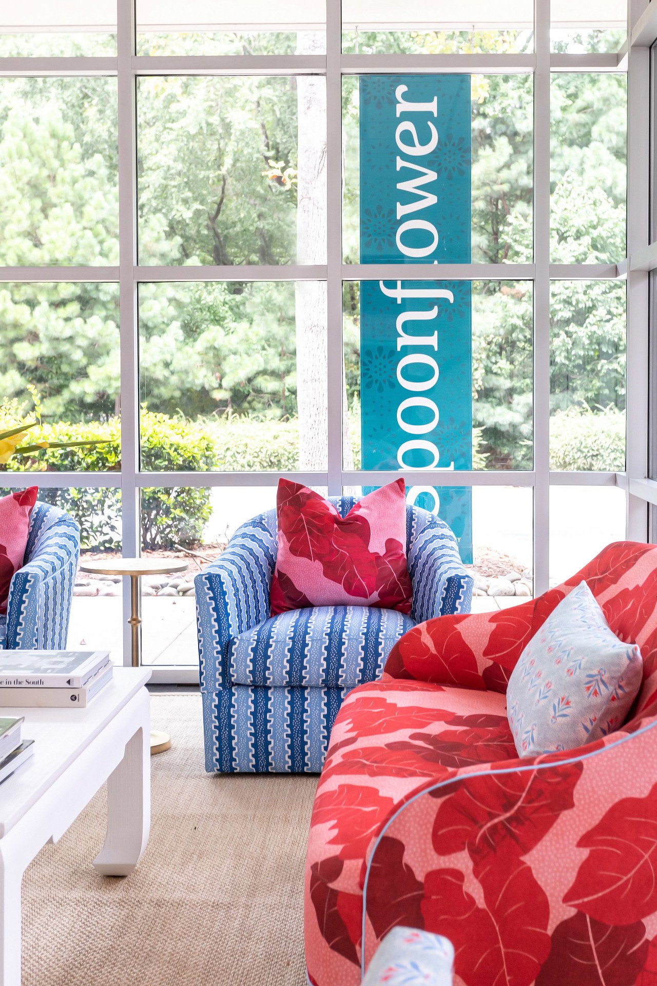
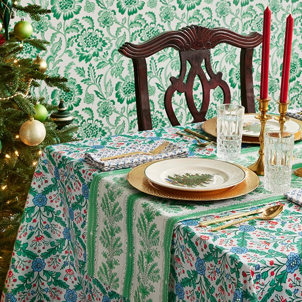
Photo credits: Cat Wilborne for Spoonflower showcasing the new logo in the office; Alex Craig for the Holiday 2023 Lookbook.
“We wanted to revisit the roots of the Spoonflower brand–the nod to the actual flower that grew in our founders’ backyard as well as the evolution from how the company started to what it’s grown into today–and reinvent from that perspective. Looking back helped us remember that the community actually spans all identities and all creative outputs in every time period; not just DIYers but interior designers and a lot more home decor enthusiasts and experts. We wanted the new brand identity to complement all our creatives and their designs with a look that’s a bit more sophisticated, but that maintains a distinctive flair.”
The Power of Partnership
Spoonflower’s promise is to use their considerable expertise to make it possible for the community to thrive. And to do that, they looked to us to execute their vision. Cowboy Collective’s multi-year partnership with the brand has built a foundation of trust and shared values. We’re a part of their creative community–neighbors in geography and ideology. We’re natural collaborators, working toward a shared vision of success that was about more than gaining followers or pageviews, but about building on the brand’s strong foundation to create an image that will carry it into the future.

And of course, we have the right team. Our skilled and experienced project manager could be trusted to keep the project organized and on track, making timelines and deliverables clear for all involved. Our branding team knew how to ask the right questions and bring Spoonflower’s magic to live through the brand’s new look and feel. It was a natural partnership, and we feel that choosing the right partner is the most important aspect of a successful project.

Cat Wilborne for Spoonflower
“My biggest take away from working as the project manager was the special attention to detail concerning the brand’s clients. The main focus for both Spoonflower’s team and Anne Mauser – our graphic design partner – while creating the new Logo and Brand details was the representation of all of their customers; the makers, the creatives, the designers, etc.”
The Power of Community
Spoonflower was built as a community for creatives and their customers beginning in 2008 when the internet as a communal space existed mostly in chat rooms, AIM windows and MySpace pages. It has always been a forward-thinking company rooted in its purpose of elevating makers and their designs. Fifteen years in, the brand refresh was a timely initiative to give the company a new look and feel that represented its storied history and its bright future, and its community of creatives was its guiding light for this evolution. As a collective of creatives ourselves, we instinctively understood the importance of centering the makers’ trust in their partnership. We were honored to be trusted with such a momentous undertaking.

The Spoonflower and Cowboy Collective team celebrating the rebrand at the Apartment Therapy event, NYC. Photo credit: Alex Craig
“The team at Spoonflower is an absolute mirror of its creative communities—full of makers, artists, design enthusiasts and, of course, lovers of color and pattern. Their perspectives and deep respect for Spoonflower’s community members really informed everything from the structure of the new flower icon to the choice of typeface in the wordmark.”
Credits/Cowboy Collective:
Project Management, Megan Pennington
Graphic Design, Anne Mauser
Credits/Spoonflower:
SVP Brand Marketing, Sarah Ward
Sr. Manager, Content & Creative, Theresa Rizzuto
Lead Product Designer, Artist Platform, Peyton Crump
Director of UX Design, Jen Miller
Sr. Product Specialist, Alexis Pennachio
Sr. Graphic Designer, Emily Kohler
Graphic Designer, Katie Lackey
Graphic Designer II, Kristina Thomas
Photographer, Cat Wilborne
Photographer, Alex Criag